
An editor of a magazine these days may receive no greater compliment than when a reader expresses his or her desire to consume the content in print rather than digital form. As my own subscription list has dwindled from a robust 75 just five years ago to a slender dozen in 2010, I still look forward to postal delivery of The New Yorker, The Weekly Standard, Reason, The New Criterion and The New Republic. Toppermost of the Poppermost, as the Beatles used to say in the early 1960s, is Britain’s Spectator, a weekly that, at least in my estimation, is the best English-language magazine on the market today. Just as it was a generation ago, and undoubtedly for decades upon decades before I discovered its mix of sharp political commentary, biting humor, personal journalism and pithy cultural reviews.
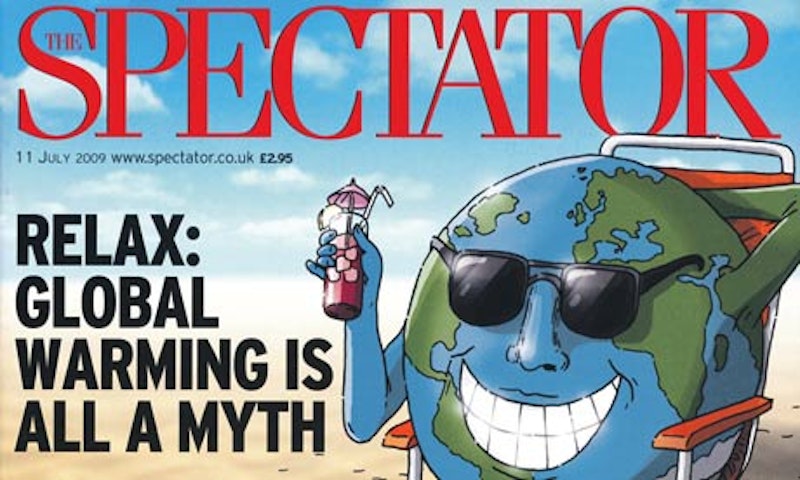
Now that the toast is drenched with butter, I must register an objection to a brief Sept. 18 editorial in The Spectator, one that attempted, without much success, to let readers know that the magazine had undergone a subtle re-design. Consistent with the weekly’s gracious tone, the alert wasn’t all that obnoxious—some magazines go to extravagant lengths to tout a new look—but even the two long paragraphs about the changes put me off, when a simple sentence could’ve done the trick. Something on the order of: “Close readers will notice that our pages have a new, modernized look this week, and it’s our hope you’ll find the changes satisfactory.”
Instead, the Spectator editorialist was a touch too cute: “We have updated the design, but cautiously, taking the best ideas from past magazines, and refreshing the rest. Even the tidiest house needs a little spring-cleaning from time to time […] Our new design makes the magazine, we hope, a little easier to navigate.” Phooey. At least the writer didn’t claim that the Spectator was now more “reader-friendly.” In addition, it was felt necessary to re-state the magazine’s vision, as if any reader needed a reminder: “Our principles are the same in the 21st century as they were in the 19th [The Spectator was founded in 1828]. We adhere not to any political doctrine, but to elegance of expression and originality of thought. We seek to offer a refuge from an often censorious and humourless world.”
Here’s the bald truth about re-designs: editors and art directors, unless their publication is flailing and desperately needs something—anything—to re-ignite its circulation numbers, often get bored looking at the same layout week after week, or month after month, whatever the case may be. Re-designing a newspaper or magazine is a lot of fun, actually, for those on the inside, especially the art department, which gets a break from the routine and fantasizes about maybe 100 different alterations, most of which are shot down by a less graphically invested editor. (There are exceptions: when Wired first exploded on newsstands in 1993, before Conde Nast purchased it several years later, it was impossible to read, so prevalent was the LSD-tinged bent of the design. That was frustrating since underneath the glittery clutter you knew there was something worth perusing, but who was willing to buy a new eyeglasses prescription just to accommodate the vanity of the art director?)
As readers of printed matter are, like most people, tied to habits, the fear among editors—but not art directors—is that subscribers will be turned off or confused by a new design, register their complaints and perhaps, in extreme cases, go elsewhere for news and opinion. And, in fact, re-designs are not generally popular. I still recall the consternation of my oldest brother when The Wall Street Journal expanded from one section to two; he was in a dither over the fact that when he read the paper on the train from New Jersey to Manhattan each morning it was now a little more difficult. And so there’s a bit of a stir at first, with negative correspondence, pointing out, with mild or outraged consternation, that this just won’t do.
Obviously, the plain reality is that once the convivial celebrations over the “new look” among the staff are exhausted, and the initial furor from some indignant readers has subsided, it’s only a matter of time before a consumer can even remember what the “old” product even looked like. Such is the case with The Spectator today: I’ve taken the lighter headlines in stride, as well as the slight increase in pastel colors, and couldn’t, right off the bat, describe what the weekly looked like back in June. What matters is that The Spectator, while appearing rather quaint in layout, contains a ferocious body of opinions, a complete magazine that has no equal in the United States.
So, onward Rod Liddle, Matthew Parris, James Forsyth, Simon Hoggart, Toby Young, Deborah Ross, Jeremy Clarke, James Delingpole, Hugo Rifkind, Taki (and what other publication would allow him to refer to New York as The Big Bagel?), Melissa Kite and Melanie Phillips, and all the other Spectator contributors who haven’t succumbed to political correctness or the American media’s rush down the rat hole.
One closing digression: As noted in this space previously, I have an odd affection for Leon Wieseltier’s convoluted middlebrow essays that close each issue of The New Republic. You get the feeling that Wieseltier is going a bit crackers, horrified at the present state of book publishing and cultural interlopers such as Mark Zuckerberg. He’s also increasingly at odds, politically, with much of the content produced by younger colleagues at TNR, although even he had to chuckle at Jonathan Chait’s excellent parody in the Oct. 28 issue, a hilarious piece betting that a GOP-controlled House would most certainly impeach President Obama. Anyway, in the same TNR Leon deviated from liberal consensus about Stephen Colbert’s recent testimony before Congress, citing it as an example of the “degradation of politics.”
He writes: “Colbert—eternally trapped in the dungeon of his character—had spent a day on a vegetable farm at the invitation of the United Farm Workers, and so he was an expert on agricultural adversity. I was reminded of the few freezing hours Martin Sheen spent on a grate with the homeless near the White House a few decades ago, after which he returned to his hotel a survivor of homelessness.”
Such a statement is heresy, of course, in liberal Washington circles, and meets the very high standards of The Weekly Standard’s indispensable “Scrapbook” column.