Why sunbathe in the front yard of your suburban cul de sac when you can do it in a teal lawn chair smack dab in the middle of Times Square!
Lawn chairs in Times Square? Great. Why don’t we just go ahead and put a pair of Crocs and a fanny pack on the Statue of Liberty, too.
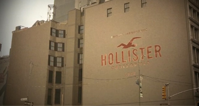
Just when I figured the dullification of New York couldn’t get any worse, I’m walking through Soho the other day and OMG: That fabulous DKNY mural on the corner of Broadway and Houston, loved by tourists and locals alike, has been painted over by the L.A.-ified Hollister “clothing” brand which just invaded downtown.
I’m so pissed off right now I just start rolling around on the sidewalk.
Here’s why I’m PO’d:
1) There’s a Hollister downtown.
2) Obviously appreciative of New York City, Hollister painted over a mural that had been there for 20 years.
3) They don’t even have the creativity to make the new ad interesting. Just a boring slab of gray to match the tragically unfabulous clothes and the even more yawnful customers. The only plus about the new Hollister are the sexy half nekid dudes and chicks who stand outside, not unlike prostitutes, hoochin’ it up and wooing customers in by showing a little titty. Cheapest trick in the book.
What’s the big deal? It's just an ad!
But the DKNY mural wasn’t just some ad. Ask any one of the millions of people who’ve photographed it in the last 20 years. I’ve never even thought of it as an ad. That thing was an icon, a work of art about the spirit of New York. DKNY, the brand, is about urban chic. Donna Karan built a fashion empire based solely on New York iconography, and the mural was a part of that.
If you’ve been living on a farm in rural Idaho and never saw the mural, you missed out! The huge letters DKNY had New York-specific imagery in them. Inside the special “K” was a fierce looking Statue of Liberty, with the rest of the letter gave a bird’s eye view of the jaggedness and grit of the New York skyline. Way in the back of the “N” you got a glimpse of the World Trade Center, with any number of skyscrapers along the way.
The capital letters D-K-N-Y presided over the mural, creating a relationship between the fashion brand and New York as its home. Everybody knows that the three colors that represent New York are black, white, and yellow because we gotta lotta streets and taxis here. And I’ve always thought that what animated the DKNY mural most were the dozens of taxis that zipped by it every second.
So like, um, why paint over this mural with the ugly Hollister logo? Oh yeah. Because Manhattan is America’s new Greatest Mall, and we gotta make sure that all the tourists and People With Fanny Packs feel comfortable! safe! sound! Just like they’re taking a trip to the local strip mall.
Not only do New Yorkers not wear Hollister, because we think L.A. is dumb, but the new ad shows no interest in our city. Hollister, which is actually a more ghetto version of Abercrombie, belongs in UR local shopping mall, because it's for suburban white peeps and this is where they go to fellate suburban white identity.
Whether you like the Hollister ad or not, you’ve got to wonder how it fits into the urban landscape. What message does it convey? Think about it: the old mural was about New York. The new facelift is about shopping malls and Middle America. That pretty much sums up the new New York.
In fairness, New York is a city that has always built itself and rebuilt itself: it breaks up with itself to find something better. But there would be a shit ton of pissed off peeps if a corporate overlord decided, “Oh, hi. We don’t need Central Park anymore. So we’re just gonna like transform the park into an airport.”
Oh no you dinnt!
Believe it or not, there is a way to make new use of the urban fabric without totally jacking it up. Exhibit A: The High Line first opened in the 1930s as an industrial railroad along the far West Side. But in June 2009 it reopened as New York’s hottest urban park. A park on an old railroad? Totally brillz. The difference is all about preservation, not letting suits decide what to keep and what to trash. If a 20 year-old mural adored by millions and an icon in its own right can’t be preserved, how do we decide what’s worth saving and what isn’t?
Ugh. So glad I moved to Brooklyn. But the instant they build a Hollister in Williamsburg, I’m might as well just pack up and move to Utah.
Hollister: Blithely Destroying New York's Soul Since 2009
The incredibly bland L.A. chain covers up an iconic Manhattan mural.