
The opening of three new stations of the century-in-the-making Second Avenue Subway, and the top-to-bottom renovation of the Lexington Avenue/63rd Street station, provide a new emphasis on subway design over the years. I’m no architecture critic, but I have paid keen attention over the years as several design aesthetics have come and gone. Let’s take a look at these efforts from the very beginning.
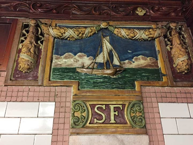
Above we see one of the ceramic sailing ships that grace the walls of the curved South Ferry station, which serves patrons of the Staten Island Ferry, accessing the #1 train. The nearby Whitehall Street station does the same for the R train. Until 2009, it was never thought to connect the two and allow free transfers until a new South Ferry station opened that year and the two lines were united. Hurricane Sandy made short work of the new South Ferry station in October 2012, so, after a few months of making Rector Street the southern terminal of the #1, the old reliable South Ferry station reopened, revealing the colorful station name tablets and ceramics one again. As a matter of fact, the ceramics were relieved of the dull brown paint job they had received and once again sport colors resembling the ones they had when the station opened in 1905.
The architects of subway stations that opened between 1904 and 1908, including the flagship City Hall station that is closed to the public except for sanctioned tours, were George Lewis Heins and Christopher Grant LaFarge, who also designed the massive Cathedral of St. John the Divine in Harlem and the original Astor Court buildings of the Central Park Zoo. Heins and LaFarge incorporated several design items they used at the Bronx Zoo into the City Hall station. These included such techniques as arches, vaulted ceilings, and polychrome tile.
In several stations, ceramic tiles and plaques were specially designed to be appropriate to the station name. For example, the Astor Place station incorporates beavers on the plaques, and namesake John Jacob Astor made his millions in the beaver pelt trade. Columbus Circle incorporates sailing ships in the station motif.

Not all stations received themed plaques. There are six Canal Street stations on the NYC subways, with the original one opening in 2004 serving currently the #6 train. Like many other stations of that vintage, there are mosaic identification plaques and also terra cotta cartouches, made at the old Atlantic Terra Cotta Company in Tottenville, Staten Island, featuring the first letter of the station and decorative touches like poppy flowers, as here, or tulips, saluting the city’s original European settlers from Holland.

In 1907, architect and painter Squire Vickers was hired to work in the NYC subway. His name is little-known these days, but he would oversee two separate regimes of subway design for the next 35 years. Vickers eschewed the ceramics and cartouches that Heins & LaFarge brought to station design, instead investing heavily in mosaics and decorative tiling, influenced by the Arts and Crafts school of design that incorporated found elements into painting and sculpture.
Here we see the mosaics of the Vernon-Jackson Avenue station in Hunters Point Queens, which opened in the mid-1910s. This style was used by both the Interborough Rapid Transit (IRT) and Brooklyn-Manhattan Transit (BMT) stations built from about 1911 through 1928.

Another Vickers design is the Canarsie Line in Manhattan and Brooklyn, among the final lines to use the Arts and Crafts mosaics, opening from 1924-1928. The line is considered the apotheosis of the design, with Vickers using somewhat off-the-wall colors like pink and purple. At the Morgan Avenue station, however, he used strictly gold, brown, and black.

When the Independent Subway, the first owned and operated by the city, opened its first stations in 1932, Vickers used a completely different and more austere esthetic. He used one color per station and used a somewhat complicated station identification code. Each local station would be made the same color, which switched each time an express station was encountered. For example, all C train station between 59th and 125th Streets are blue, switching to green for the local 135th Street station, and to gold at the express 145th Street station. The city acquired the BMT and IRT and unified the formerly competing systems under one banner.

For several decades after the last IND station at 179th Street in Queens was completed in 1950, station design drifted. With no new lines being built, there was no new unifying design system. However, we do have hints of what station design would have looked like had any lines been designed and built. In 1970, local stations along the BMT 4th Avenue and Broadway lines (R and N trains) received a streamlined makeover with new walls installed covering the originals, with white and contrasting tomato, blue, gray, and gold color blocks. In the 1990s, all of the stations on the Manhattan Broadway Line except Rector Street were restored to their original treatment with the new walls knocked down; Brooklyn’s kept their 1970s treatment.

During this period (1950-2005), several individual stations were updated with glazed color brick, a favorite design tactic in the 1970s. This compromised the character of stations like Wall Street on the #4 and #5 lines that opened in 1905. Thankfully, Wall Street has had its original look restored. However, glazed brick, this time in orange, still holds sway at Bowling Green and 49th Street. We can say that these stations are a time capsule of sorts from the 1970s.

The new Second Avenue Line has once again given subway architects an opportunity to apply a singular esthetic to several lines. All of them are set deep below ground, requiring an elevator or several flights of escalators to access. White has been the color of choice for subway stations since at least the mid-2000s; the new South Ferry station that opened in 2009 and is due to reopen in 2017 is a study in the aggressive application of white station walls and passages.
In both South Ferry and the new Second Avenue stations, such as 72nd Street, above, the relentless white is relieved by artwork commissioned by several contemporary artists arrayed along the mezzanine walls and at entrance foyers. Jean Shin presents images reminiscent of the Second and Third Avenue El at Lexington/63rd; Vik Muniz presents portraits of “everyday people” at 72nd Street; Chuck Close presents images of artists and musicians at 86th Street, including Philip Glass, Lou Reed, and himself; and at 96th Street, Sarak Sze’s “Blueprint for a Landscape” presents designs in blue and white, as you might expect.
When new stations long the Second Avenue Line appear eventually, both uptown and downtown, the same esthetic will most likely be employed, making them time capsules for future subway riders.
—Kevin Walsh is the webmaster of the award-winning website Forgotten NY, and the author of the books Forgotten New York and also, with the Greater Astoria Historical Society, Forgotten Queens.