
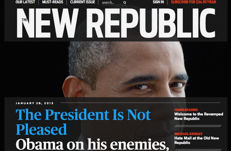
At the risk of writing for a very limited audience, here are a few more thoughts on 29-year-old Chris Hughes’ new New Republic, the nearly century-old opinion magazine that, to the fanfare of Beltway journalists, unveiled a frightening new design in January. So far, Literary Editor Leon Wieseltier, despite his consistent haranguing of President Obama’s feckless foreign policy—in contrast to Hughes’ cheerleading—has survived the new regime, but I’ll stick with the prediction made in this space two months ago that he’ll be shown the door (although undoubtedly with what passes for a “golden parachute” in small-time media) at some point, sooner rather than later. (By contrast, “TRB” columnist Timothy Noah, whose unabashed liberal political views are in lockstep with Hughes and most of TNR’s staff, was unceremoniously axed last month, and immediately took to Twitter in search of a new job.)
Reason’s Matt Welch wrote an excellent diagnosis of TNR’s transformation from liberal “contrarianism” to Democratic cheerleader last month, in which he essentially said that the magazine has now—in contrast to past decades when editors like Andrew Sullivan (at one time semi-conservative), the late Michael Kelly (a professed “Humphrey Democrat”) and Peter Beinart (foreign policy hawk) regularly stirred up trouble—become just another preach-to-the-converted outlet that, at least for political commentary, doesn’t much matter anymore. Welch allowed that Hughes’ largesse will pay for some fine essays, such as those by Walter Kirn and Michael Lewis, but the magazine’s days as an outlet for writers to deviate from liberal orthodoxy are kaput. Hughes’ grand plan to make TNR a New Yorker for his small, (mostly) DC audience might’ve made sense 15 years ago, but the Condé Nast title itself is not in the best shape: harrumph all you want about readers devouring New Yorker articles via tablet or smart phone—if you have 20-20 vision—but its slim print issues, still filled with long and often excellent stories, tell a different story. If you can find a quorum of people under the age of 35 who are New Yorker devotees, I’d be very surprised.
What I find curious about Hughes’ TNR is that the dramatic re-design, for which he probably overpaid, is such a jumble, recalling the early 1990s when magazines updated their look by swiping key elements of the ground-breaking Spy. Hardly anyone remembers Egg, the short-lived culture monthly financed by the late Malcolm Forbes, but that’s what TNR today reminds me of. Normally, I roll with publication re-designs—less frequent in this decade, for obvious reasons—figuring either the editor or art director was bored, and after two issues you’d forget what the old design looked like.
But I’ve got the April 8 TNR in front of me, and, ignoring the creampuff articles on MSNBC’s Phil Griffin or Julia Ioffe’s embarrassing profile of Gene Sperling, National Economic Council chief, it’s flabbergasting that Hughes thinks this busy, busy, busy design has any upside. Maybe he doesn’t really care about the print product—imagining all those TNR cafes and seminars and goo-goo summits to better the country with implicit Obama-sanctioned Democratic politics—but as a subscriber who does read the biweekly in print, I’m stymied. Page one alone, the ostensible Table of Contents, has at least 21 teasers for items inside, though to be fair, my count might be off since it’s such a mess. For example, scattered throughout are dropped caps that are about a mile away from the second letter of the first word of an article.
Advertisements are scarce,
but even some of those are fairly indistinguishable from the actual content:
there’s a four-page advertorial, “Six Steps to Effective Teacher Development
and Evaluation,” written by Vicki Phillips and Randi Weingarten, and sponsored
by the Bill & Melinda Gates Foundation, that blends into the mish-mash of
copy. Granted, even though this spread was probably purchased, it’s the kind of
piece that the new TNR would run
anyway. I understand that Hughes is loaded, and can chuck money anywhere he
wants, but has he cowed subordinates so thoroughly that
no one says that a page of white space (with a tiny picture of Sperling) is
outdated and expensive? Say what you will about Harper’s unapologetic left-wing content, although I do enjoy
flipping to Thomas Frank’s monthly essay, just to see if he’s stopped his
bizarre preoccupation with the Tea Party, but it’s a very easy magazine to
read. Oh, and back to the enlarged capital letter: in the Sperling travesty,
there’s a giant ornamental “O” at the top of page 34, even though the first
word, “On,” is spelled out.
I did like David Thomson’s review of Derek Cianfrance’s The Place Beyond the Pines, which smashed David Denby’s New Yorker essay on the same film to bits, and the typeface for the section dubbed “The Mall” was a pleasant reminder of last year’s great novel The Art of Fielding, but by and large, if Chris Hughes is looking to expand his audience this current iteration just ain’t working.
—Follow Russ Smith on Twitter: @MUGGER1955